GalleryPal
A Virtual Docent in your Pocket
Modified GV Design Sprint
Home Screen V2 Solution
Home Screen V2


The Problem
GalleryPal is a new startup that wants to improve the experience of viewing art in a museum or gallery.
The Solution
Provide on-the-spot information about a piece or artist, cater the information to the user’s existing knowledge of the topic, and allow the user an opportunity to react and reflect.
The Product
GalleryPal provides information about a piece or artist. Users can individualize their experience by selecting desired content, saving favorite pieces, and recording their thoughts on demand.

Context & My Role
This case study outlines my design process while completing a modified GV design sprint. This modified sprint consisted of five days, with each day focusing on a specific step in the design process: understanding & mapping, sketching, deciding & storyboarding, prototyping, and testing. As the sole designer in this solo sprint, I was responsible for independently completing all steps in the design process.
Day 1 - Understanding & Mapping

Methods: User Interviews, Expert Interview, Affinity Mapping, Experience Mapping
Deliverable: End-to-end Experience Map
GalleryPal wants to create a better way for people to interact with art when visiting museums and galleries. Constraints dictate that the desired product will be a mobile app and will focus on improving in-person experiences.
Research
Research resources include pull quotes from user interviews and an expert interview with Lena Carroll, a tour guide at Museum of Natural History in New York. Using the information from these sources, I completed an affinity mapping exercise to identify themes that could reveal possible solutions. I gained the following insights:


Providing a story with context (artist bio, techniques, period, fun facts, etc.) elevates the pieces and makes for a more holistic experience.
The type of information people want is dictated by their level of background knowledge/expertise.
People should be able to have their own, individualized reactions to pieces (e.g. emotions, opinions, conclusions).
Solution Ideation
Whatever mobile app solution I came up with had to allow the user to complete the following tasks:
find information about a specific piece of art/artist on demand
select only the content pertinent to their interests/expertise
react to and reflect upon pieces at will.
I drew out an end-to-end experience map that I believe best utilized the solutions to the identified problems:

Day 2 - Sketching

Methods: Lightning Demos, Crazy 8’s, Solution Sketching
Deliverable: Solution Sketch
Lightning Demo


At the outset of sprint day two, I completed a solo lightning demo to study solutions utilized by competitor apps that set out to solve the same or a similar problem. I found and researched the following direct and indirect competitor apps: WikiArt, Bloomberg Connects, and Smartify. Below are some screens from those apps and my take on how they aim to solve the problem.
WikiArt

-
One search bar to search for a painting title, artist name, gallery, etc. Do not need to specify a category.
-
Staggered presentation of the paintings is visually pleasing and interesting.
Bloomberg Connect
-
The painting profile page includes an image, title, materials, location, an audio clip giving background on the painting and artist (with transcript for people with hearing impairments), verbal description of the painting itself (for people with visual impairments), and suggestions for additional works. Great accessibility features.
Smartify


-
Including fun facts is a nice way to get fun, bite-sized pieces of information about the piece that are approachable from any level of interest/expertise. The highlights are great for helping to recognize the subjects of the fun facts in-person. I appreciate that you are about to swipe through multiple facts without having to leave the main screen.
-
Scanning a piece in-person makes information so easily accessible. This should be available with minimal taps. Excellent feedback on system status; scanning, searching, and results.
-
I’m torn here between the neat look of having the “Read more >” hyperlink and having all information available on a piece’s “profile” screen. May need to use collapsing sections (+/-) to include all information without looking too cluttered.
-
Vital to be able to save a piece to your own gallery / library.
Critical Screen
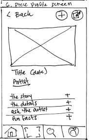
Before sketching, I decided that I needed to focus on the product screen for specific works. This screen would have to house all accessible learning content. It would include a photo, artist name, year created, materials used, a high-level summary, and an in-depth discussion. Additional desirable features included a way to like/save pieces and a note-taking feature.
Crazy 8’s & Solution Sketch
Inspired by features and UI elements from the solo lightning demo, I sketched eight different versions of my critical screen for one minute each. I chose my favorite screen and fleshed it out in a solution sketch. The sketch included the critical screen, as well as the screens before and after.
Crazy 8’s

Eight different screens that each included desired elements, including audio/video content housed on one scrollable page with expanding sections.
Solution Sketch

Three-screen solution sketch that included the search results page, the artwork profile page, and the expanded version of the artwork profile page that showcased the audio/video content.
Day 3 - Deciding & Storyboarding

Methods: Storyboarding, Wireframing
Deliverable: Low Fidelity 12-panel Storyboard
Storyboarding
I completed a 12-panel wireflow sketch of four tasks: searching for and finding a piece of art, exploring content related to the work, writing a note about the work, and liking/saving the work. I included several task flows in my storyboard. They came together as consecutive elements to create a larger flow that helped accomplish the overall goal of improving the experience of viewing art in-person.

Note Function
Favorites

Artwork Profile V1 Pain Point
Artwork Profile V1
Artwork Profile V2 Solution
Artwork Profile V2


Day 4 - Prototyping

Methods: Style Guide/UI Specifications, Figma Prototyping
Deliverable: Clickable High Fidelity Prototype
Before designing high-fidelity screens, I put together a “quick and dirty” style guide to ensure all components were consistent:

High Fidelity Prototype
The first iteration of the prototype includes parallel flows for identifying artwork by either scanning or searching by name/artist. Once found, the user can listen to audio, read transcripts, add to favorites, and write notes.
Featured Screens
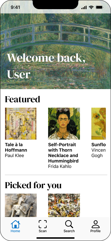
Home Screen

Artwork Profile
Day 5 - Testing

Methods: Usability Testing, Iterative Design
Deliverable: Updated High Fidelity Prototype
Usability Testing
I completed five usability tests to learn how people interacted with the app ad identify pain points. Testing sessions were both in-person and remote. Users were unfamiliar with my project and ranged from 31-72 years old.
Usability testing sessions revealed five pain points:
The home screen did not effectively communicate the purpose of the app
Users were confused about the medium of the content of the artwork profile pages
The note writing function required too many steps
Not clear enough that an artwork had been selected as a favorite
Users didn’t know where they would find account information
Home Screen V1 Pain Point
Home Screen V1
Note Writing V1 Pain Point
Note Writing V2 Solution
While composing a note in the modal window, users anticipated automatic closure upon saving the note. The additional step of manually tapping the X to exit proved mildly frustrating for some.
Eliminate the need for the X button and implement a system where the modal window automatically saves and closes with a slight delay upon tapping "Save."

The app's purpose was not immediately discernible from the home screen alone. While it's evidently connected to art, users found ambiguity regarding its specific focus. Notably, there was a lack of clarity regarding the app's primary goal of enhancing the in-person art experience.

Revise the home screen collections to prioritize exhibits "nearby" over "featured" pieces. This shift can enhance clarity regarding the app's purpose as a supplement to the in-person experience.
“Starred” Artwork V1 Pain Point
“Starred” Artwork V2 Solution
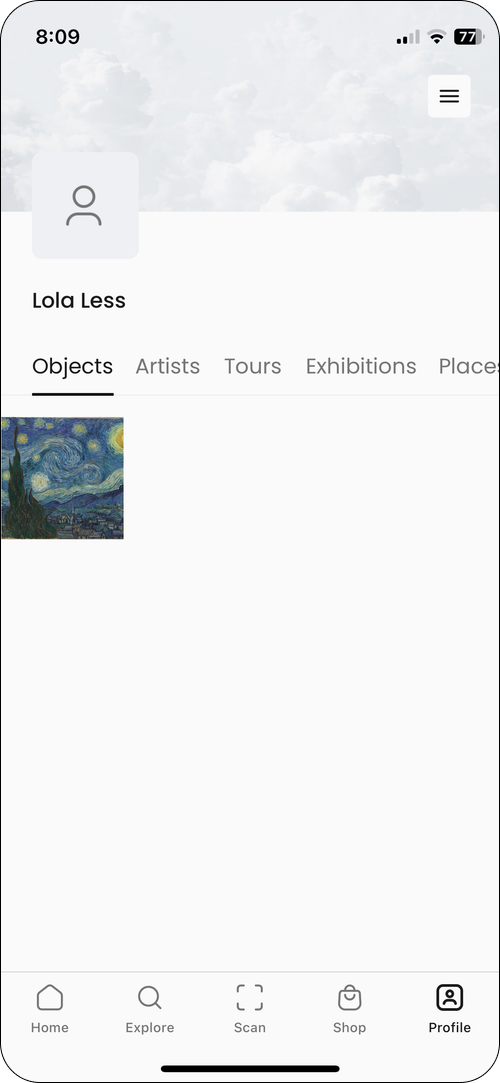
Your Favorites V2 Solution
Favorites Library V2

Upon reaching the artwork profile page, users mistakenly assumed all content was video, not audio. This is a crucial issue to address, as we aim to avoid disappointing or underwhelming user experiences.

The simplest fix is to add "Audio" before the content's title. A more intensive option could involve replacing the play button with a headphones icon and adding an extra play button next to the "transcript" button, though this may risk UI overcrowding.
Note Writing V1
Note Writing V2
Users noted that the distinction between the selected and unselected states of the favorite (star) button was not very apparent.
Revise the inactive state to display a subtle outline, and for the active state, use a filled icon in a distinct color.

Not Starred V2
Starred V2


Not Starred V1

Starred V1

Your Favorites V1 Pain Point
Users expressed confusion as their profile screen exclusively featured favorited items, leaving them uncertain about accessing account information and locating their notes.
Favorites Library V1

Enhance user experience by incorporating a dropdown caret next to the username on the favorites page, serving as a menu for comprehensive account information. Additionally, organize the page into distinct sections for "favorites" and "notes."

Next Steps
Prior to Launch:
Ask test users to complete a System Usability Scale (SUS) survey as a means to track quantitative data longitudinally.
Know what the Key Performance Indicators (KPIs) will need to be measured once the product has launched.

After Launch:
Complete a another round of usability testing with the launched product to ensure V2 fixes adequately addressed initial pain points and identify new pain points.
Continue to collect SUS scores as a means of quantitative data tracking.
Continuously track KPIs to determine when and how it makes sense to refine the platform.
What I Learned
Be intentional about visual design choices. Even very small visual design decisions can communicate a lot about a feature and can dictate users’ expectations.
Rapid prototyping yields actionable feedback. The design sprint format highlighted the power of quickly translating ideas into tangible prototypes, allowing for immediate user feedback.