SLIPSTREAM


Timeline
90 Hours
Role
UX & UI Designer
Platforms
Desktop, iOS Mobile
Tools
Figma, FigJam
Project Type
Solo Case Study
Project Overview
In this solo case study, my mission was to enhance the browsing and checkout experience for a fictional cycling e-commerce site. I aimed to increase revenue by improving the conversion of product browsing into successful checkouts.
The Problems
-
The PM’s hypothesis was that users were unable to determine which bike was best based on relative features, supported by the fact that, on average, 50% of users opened 7 item pages and ultimately abandoned the site without moving any of those items into their cart.
-
Data showed that 70% of users abandoned their carts at the registration page, where they were required to create an account to complete their purchase. The PM wanted to design a guest checkout to address this problem. Requirements for guest checkout included that it must capture the customer email.

The Details
Target user demographic: 24 - 38 years old, 72% men, high income earners, and they take biking very seriously
Company’s brand personality: an expert in the field who is always knowledgeable about the very latest trends and best products related to biking
Desired brand attributes: savvy, focused, serious, and dependable
The Objectives
Design a product comparison feature.
Create a Guest Checkout option.
Discover
Methods: Market Competitor Analysis, User Interviews
Market Competitor Analysis
User Interviews
Once I had a good understanding of industry standards for product comparison and checkout flows in the cycling e-commerce space, I completed user interviews with four individuals, each of whom fell into at least three out of four target user demographics.
User Interview Insights
User interviews yielded three insights about how users research and compare bikes and three insights about how users feel about the online checkout process on most e-commerce sites.

Product Browsing Insights:
-
Inexperienced users didn't research much before buying a bike. They often trusted bike shop recommendations and cared about how the bike felt during a test ride.
Experienced users relied on friends, online bloggers, and vloggers who compared bikes. They also checked the manufacturer's website for technical details.
-
Besides the bike's features, external factors influenced the purchasing decision.
Users cared about the bike's appearance, specifications, and ease of maintenance.
Additionally, brand reputation, price, and speed of delivery were important to users when choosing a bike.
-
Users need specific info and positive reviews from trusted sources to buy a bike online. Those with less knowledge want to test it in person even with that info.
Checkout Flow Insights:
-
Users create accounts when they plan to shop again or when it's easy.
They prefer signing in with Google or Apple, as it auto-fills info. They like creating accounts during guest checkout or for subscriptions. If they love the shopping experience, they make an account.
-
Users often choose guest checkout when they're uncertain about the benefits of creating an account, don't plan to return, or it's a one-time purchase.
They believe making an account might be slower, worry about spam, and have security concerns. For one-time purchases, an account doesn't seem necessary.
-
Users tend to abandon their cart and purchase when the checkout flow is disrupted by a roadblock or distraction.
When recounting instances of abandoning their carts/purchases, users consistently mentioned the idea of friction or the checkout flow being “slowed down” enough for them to either become distracted or talk themselves out of making the purchase. Such examples included having to create an account, not remembering their existing login credentials, and surprise charges (e.g. high shipping costs and fees). When faced with these pain points, many users just decided to give up; it wasn’t worth the extra energy and/or funds.
Some users mentioned that they used their shopping cart as a way to compare product options (not having the feature elsewhere). They would compare items within their shopping cart and remove the items they didn’t want. However, comparing items in the cart caused a delay in the actual checkout process, giving the user more time to decide that they didn’t really need the item after all.
Design
Deliverables: User Flows, Low-fidelity Prototype
User Flows
Considering user interviews, I designed a flow for product comparison and checkout. It emphasizes access to "expert opinions" in different formats and offers easy checkout options.

Low-Fidelity Prototype
I used Figma for a low-fidelity, clickable prototype that covered product comparison and checkout in the user flow. This prototype served for initial usability testing and as a foundation for high-fidelity mockups.
Validate
Methods: Usability Testing, Testing Synthesis
Usability Testing - Round 1
I completed the first round of usability testing using the low-fidelity prototype. I asked five users (all of whom fell into at least two of four target demographics) to complete the following open-ended tasks:
Find a specific type of product (ex: downhill mountain bikes).
Filter results (ex: by price and brand).
Compare the remaining products and determine which has the most desirable feature (ex: the lightest frame).
Navigate to and explore the product page.
Purchase the product as a guest.

Tasks were considered “failed” if three or more users gave up, repeatedly attempted to complete the task incorrectly, and/or verbalized dissatisfaction.
Note: Because the focus of this particular project was on the desktop experience, I completed user testing with the desktop prototype exclusively. I would have liked to complete two rounds of testing for each interface, but was limited by time.
Results
Overall, four out of six tasks were completed with a 100% pass rate. However, the following tasks did not pass the usability test: comparing products (40% pass rate) and purchasing products as a guest (20% pass rate).
Pain Points
-
Visibility Pain Point: The “Compare Products” feature was represented by a low-contrast, rectangular widget in the bottom righthand corner of the screen (screen 1). Users rarely noticed it.
-
System Status Pain Point: When a product was added to the “Compare Products” feature, a success toast would pop up above the widget for several seconds (screen 2), but would then disappear. When the toast disappeared, the number on the widget would increase (screen 3), but the contrast was too low. The user then needed to manually open the widget to see which items were added and to begin the comparison process (screen 4).

“Compare Products” Empty State
Confirmation of item added to “Compare Products”


System Status of “Compare Products” feature

Start comparing products
-
Guest Checkout Pain Point: Users have the option to login as a guest, which requires inputting an email and clicking “Check out as a guest”. However, most users did not input an email before trying to click on the “Checkout as a guest” button. This is most likely due to the poor spacing and lack of email field above the “Checkout as a guest” button. It’s not clear that the email field is mandatory.
-
Express Checkout Pain Point: Some users indicated confusion about putting the express checkout options (Apple, Google) on the “Returning Visitors” side, as a new visitor would also be able to use those checkout options.

Guest Checkout
In order to address the above-mentioned pain points, I focused on the following goals when designing my high-fidelity screens:
Improve visibility and clarify system status of “Compare Products” feature.
Simplify checkout flow’s login/register page.
Design
Deliverables: Design System, High-Fidelity Mockups
Design System
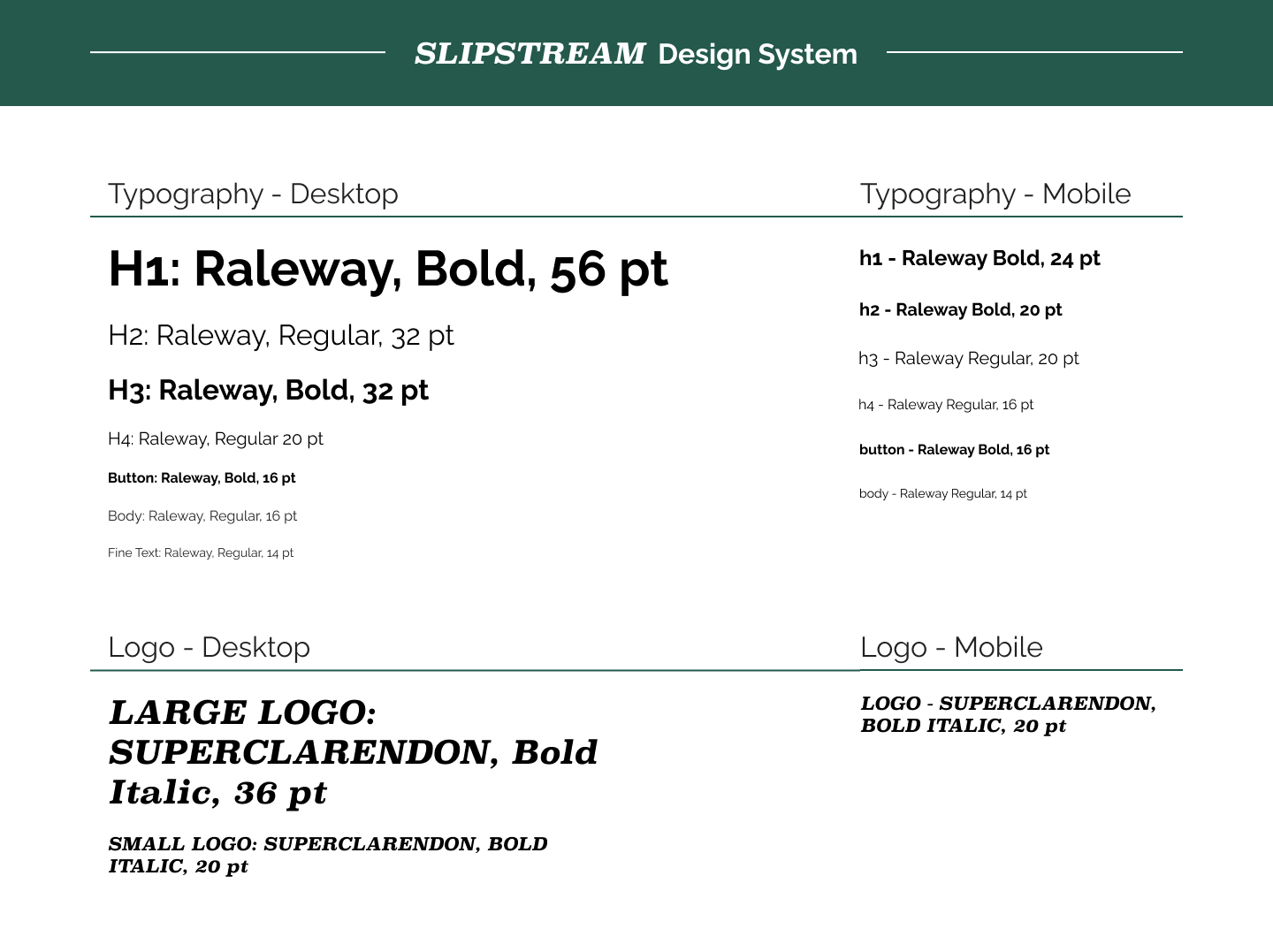
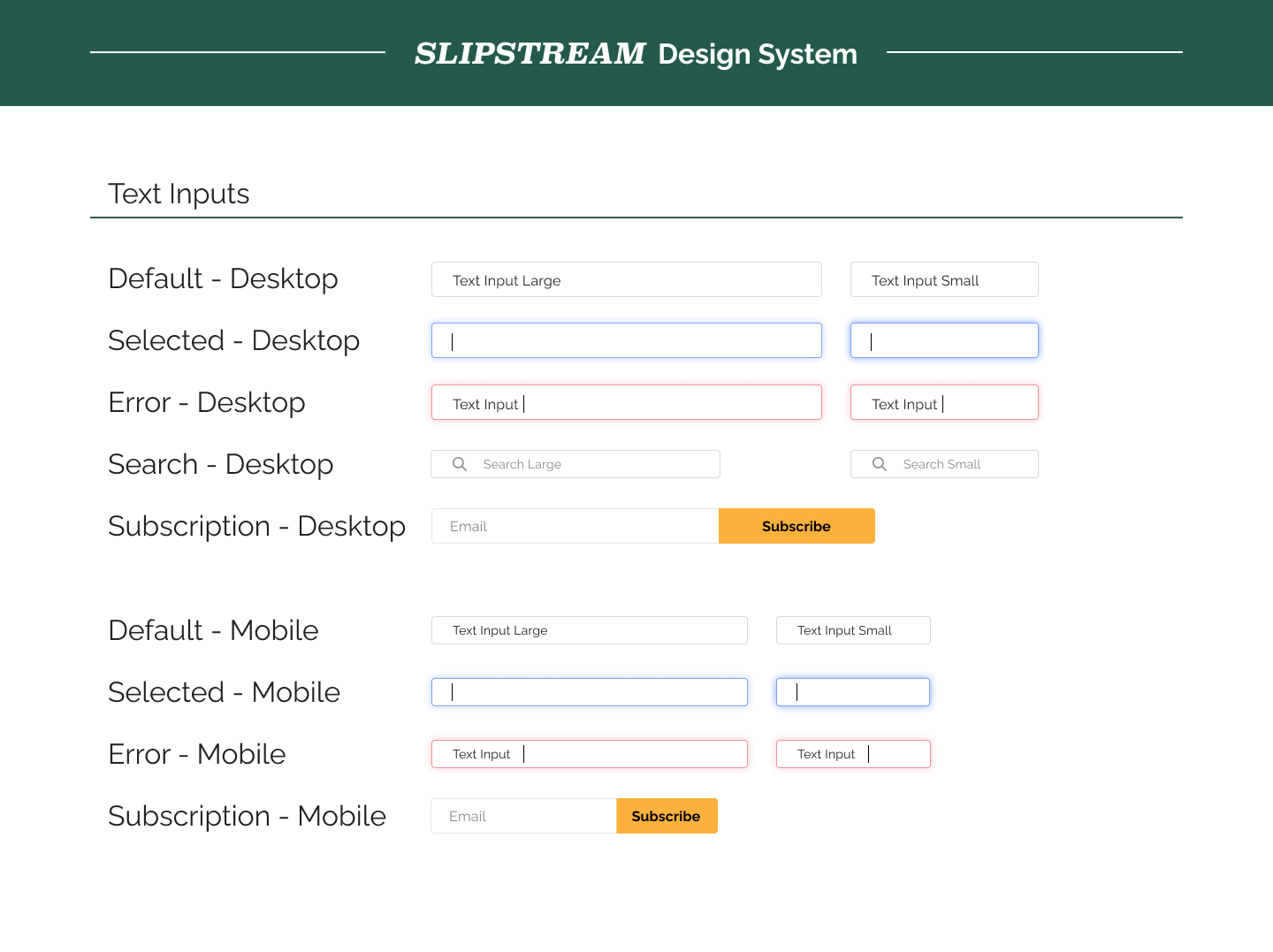
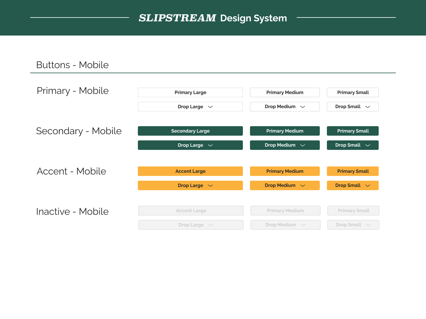
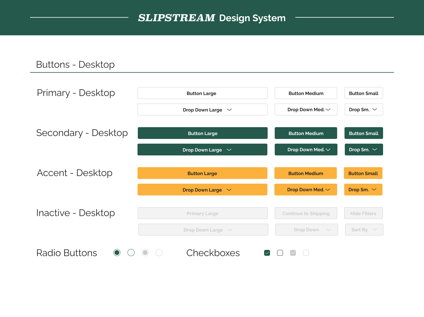
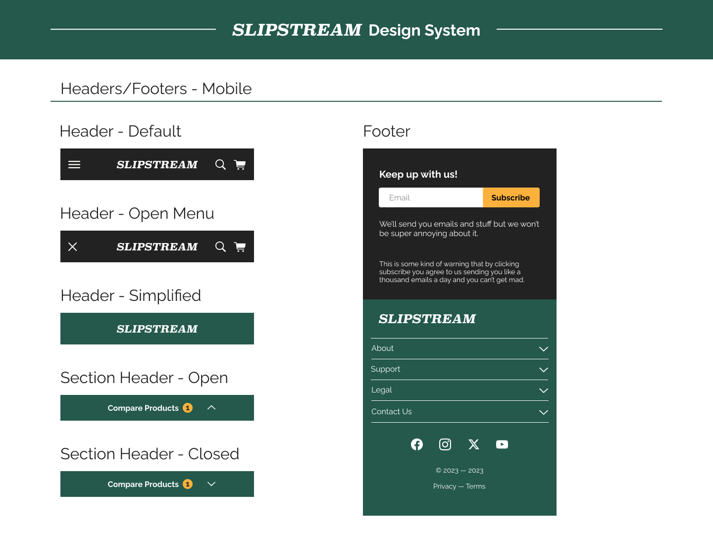
Before beginning high-fidelity designs, I decided on the majority of my design elements and made sure they were consistent with brand identity details. I used simple, readable sans-serif fonts and nature-inspired colors that had a masculine but not harsh feel. I tested different color combinations to ensure contrast met WCAG standards.

High-Fidelity Designs
With the goals from the first round of usability testing in mind, I began designing the high-fidelity mockups and clickable prototype for my desktop interface. Below are several screens.

Homepage

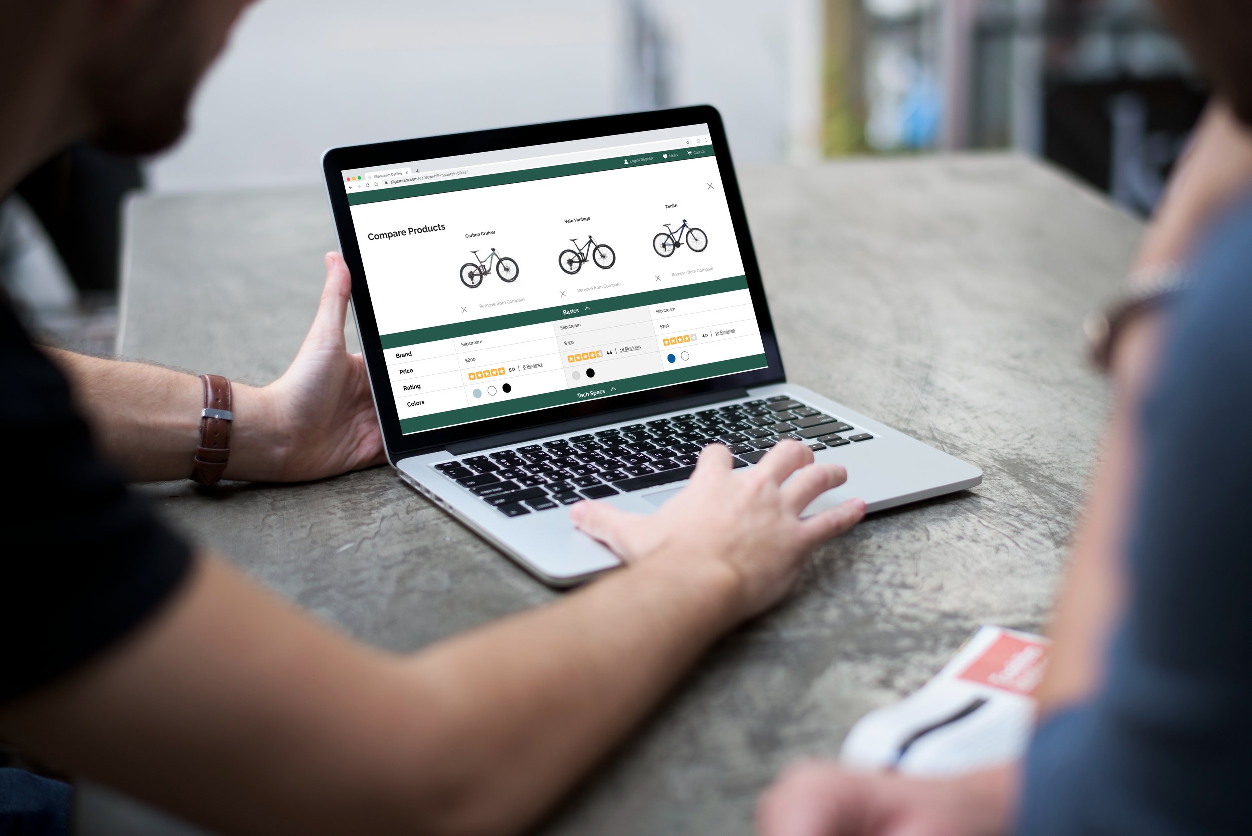
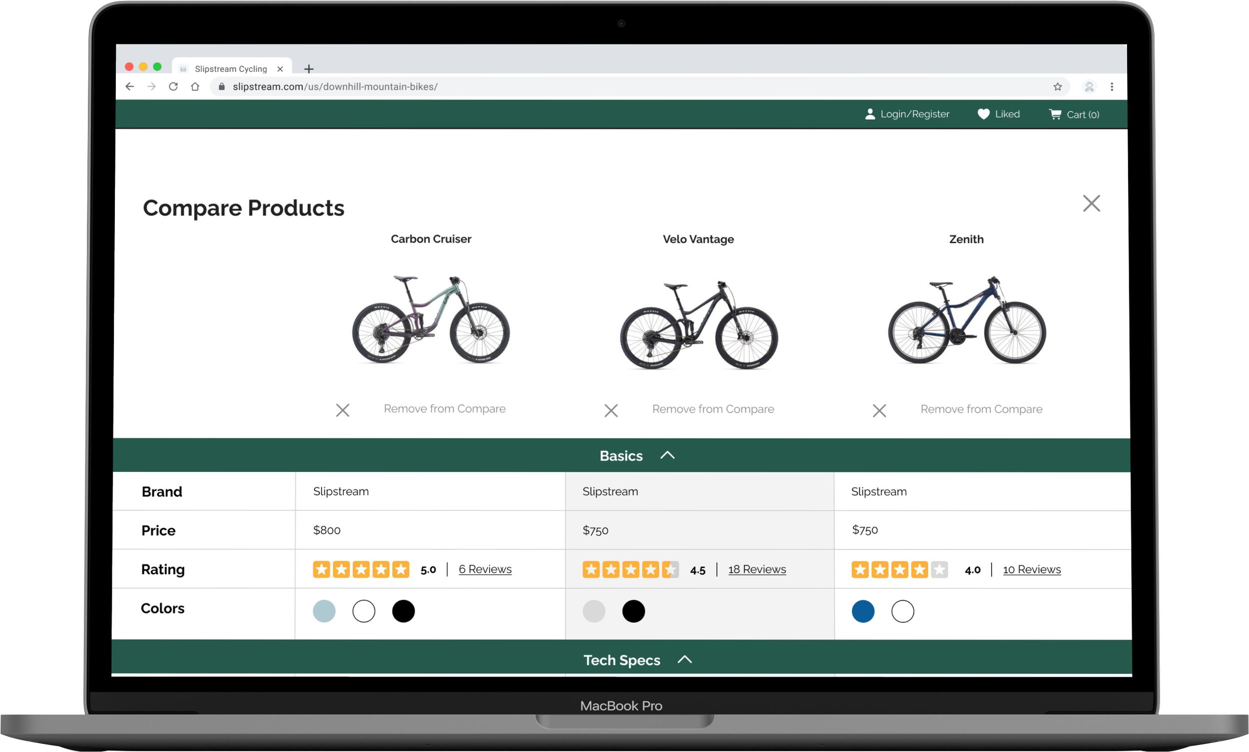
Product comparison page

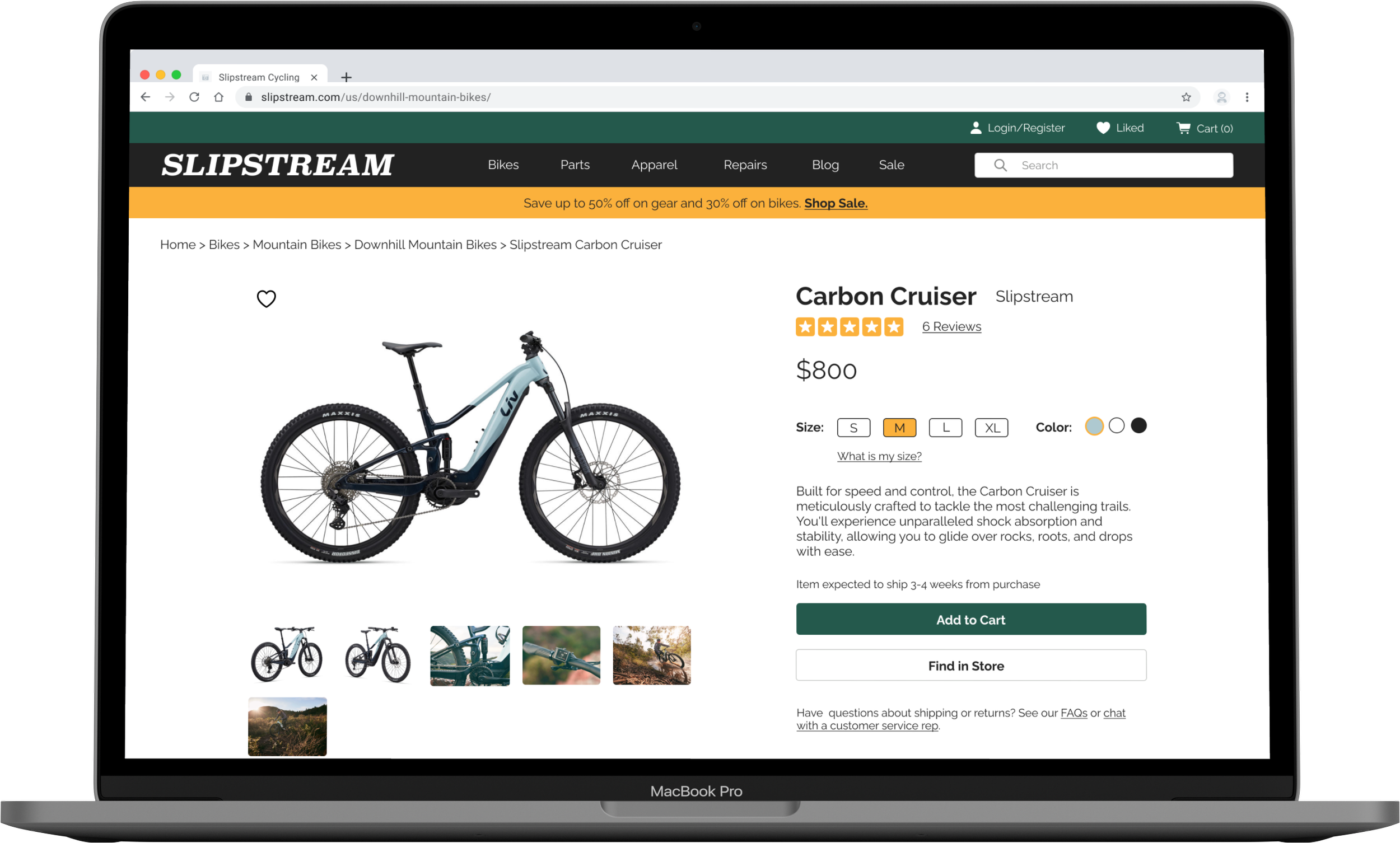
Product page
Iterative Improvements from Low-Fidelity Designs
The majority of changes made to the prototype from low-fidelity to high-fidelity are described below. All changes were made in the hopes of accomplishing the goals set out after round 1 of user testing.
Goal 1: Improve visibility and clarify system status of “Compare Products” feature.
-
Visibility Solution: In the high-fidelity version, the “Compare Products” feature empty state isn’t visible (screen 1), but becomes visible once a product has been added (screen 2). Once a product is added, the bottom sheet stays open unless the user manually minimizes it. The bottom sheet contains a high-contrast header (in both open and closed states) for improved visibility overall.
-
System Status Solution: Each time a product is added to the “Compare Products” feature, the bottom sheet pops up and displays all added items. The “Start Compare” button is visible unless the user manually minimizes the feature. If the user minimizes the feature, there is still a high contrast number indicating how many items have been added to compare.

“Compare Products” Empty State

Item added to “Compare Products”

Start comparing products
Goal 2: Simplify checkout flow’s login/register page.
-
Guest Checkout Solution: Users presented with only one registration field and asked to provide their email without the need to commit to account creation. After entering their email (screen 1), they have two paths:
If the email is registered, they can either log in or proceed as a guest.
If the email is not registered (screen 2), they are given the choice to create an account or proceed as a guest.
-
Express Checkout Solution: Instead of splitting the checkout/registration page into “Returning Visitors” and “New Visitors”, all email and express checkout options have been consolidated into one column (screen 1). Hopefully this simplifies both the visual design and the usability of this screen.

Login/registration page

Account creation page
Validate
Methods: Usability Testing, Testing Synthesis
Usability Testing - Round 2
I completed the second round of usability testing using the high-fidelity prototype. I asked five new users (all of whom fell into at least two of four target demographics) to complete the same open-ended tasks as the previous round of testing. Wording of the tasks was changed for clarification:

View the site homepage and describe elements and functions they notice.
Find a specific type of product (ex: downhill mountain bikes).
View and filter search results (ex: by price and brand).
Utilize the compare tool to compare the remaining products.
Navigate to and explore the product page.
Purchase the product as a guest.
Again, tasks were considered “failed” if three or more users gave up, repeatedly attempted to complete the task incorrectly, and/or verbalized dissatisfaction.
Results
This round, only one out of six tasks were completed with a 100% pass rate and two our of six tasks were completed with a 80% pass rate. Three out of six tasks did not pass the usability test: view search results and filter results (60% pass rate), comparing products (40% pass rate) and purchasing products as a guest (20% pass rate).
Paint Points:
-
Users verbalized confusion over a number of things, most of which were elements included on the product cards. In some cases, it was unclear if “Compare” and “+” were one button or two. Some users stated that they didn’t learn much at all about the products they were browsing (besides price, name, and brand) and felt like they would need to open up each product page individually to find relevant information. Finally, the “save” bookmark icon, was not universally recognized.

Search results page
-
The most frequent question that came up during user testing was "What does ‘Primary’ mean?” Making a product “primary” was an artifact from the mobile design that, ultimately, didn’t make sense to retain on the desktop site. Additionally, users often attempted to add additional items to the compare feature by clicking on the empty square (a visual indication that there was room for one more item). However, the square was purely there as a placeholder and possessed no real function. Finally, there was too much copy on the righthand side and users rarely read it.

Product compare feature bottom sheet
-
Users stated that they liked the “bottom line” feature of the reviews, but that they wished there was a way to sort the reviews by rating, date, etc. Most users said they only read the best and worst reviews before making a decision. Additionally, some users were frustrated and wanted more reviewer demographic information. Users wanted to make sure that the review they were reading was really applicable to their needs, skill level, etc.

User Reviews
-
Users understood that entering an email was mandatory to begin the checkout process. However, all users were displeased with having to share their email immediately, without assurance that they could checkout as a guest and not have to create an account. Some users were confused about the header copy saying “Log in” because they didn’t have an existing account.
Login/registration page
-
Checkout Flow Navigation Pain Point: While users were able to successfully complete the checkout flow, several mentioned that they were unsure if they would be able to return to a previous page and/or if the information they had input would be saved. For example, the icons for the completed sections on the progress bar (i.e. personal and shipping) are greyed out and look as if you would not be able to navigate back to them (screen 1). Also, when looking at the order summary (screen 2), it’s not clear what will happen when you click on the arrows associated with each section. Users were afraid that if they made a mistake, they would have to start over.

Payment information screen

Order review screen
In order to address the above-mentioned pain points, I focused on the following goals when designing the second iteration (V2) of my high-fidelity screens:
Make “Checkout as a guest” option more immediately available.
Redesign and add content to product cards, including modifying “Compare +” button and save/bookmark button.
Redesign “Compare Products” bottom sheet to remove ambiguous functions and language.
Add additional buyer review details and include the ability to filter buyer reviews.
Improve navigation within the checkout flow.
Design
Deliverables: High-Fidelity Mockups (Version 2)
High-Fidelity Designs (Version 2)
I iterated on my high-fidelity desktop prototype and created a first iteration of the high-fidelity mobile prototype, emphasizing insights from the second round of user testing.
Iterative Improvements from High-Fidelity Designs (Version 1)
The majority of changes made to the prototype from high-fidelity (V1) to high-fidelity (V2) are described below. All changes were made in the hopes of accomplishing the goals set out after round 2 of user testing.
Goal 1: Make “Checkout as a guest” option more immediately available.
-
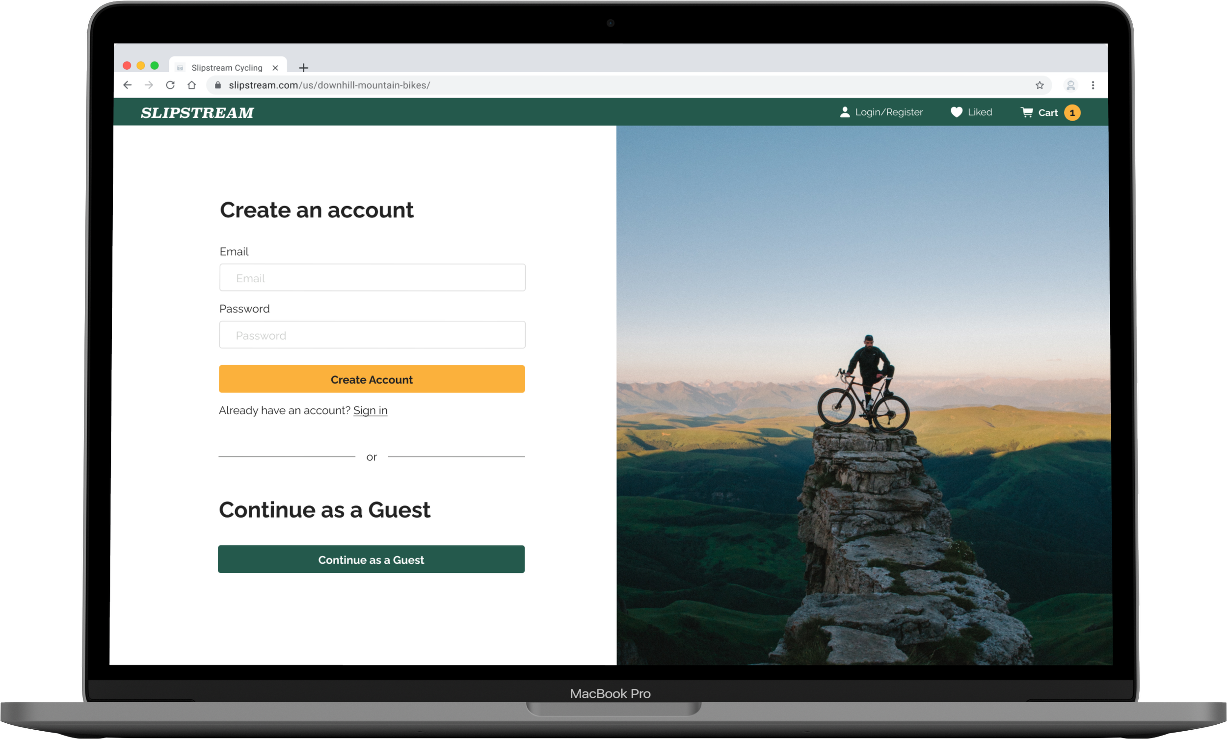
Guest Checkout Solution: To address users’ frustration with having to immediately share their email and possibly be forced to create an account, the “Checkout as a Guest” option is clearly available (large header and high-contrast CTA button) from the very beginning of the checkout flow. Users can also see that, while there is an option to create an account, they can immediately ignore it if so desired.

Login/registration/guest checkout page
Goal 2: Redesign and add content to product cards, including modifying “Compare +” button and save/bookmark button.
-
Product Cards Solutions: In V2, the underline was removed from the “Compare” copy (indicating that it is not a clickable element) and accompanied by a checkbox. Some users stated that they expected clicking on “+” would give them more information or a product quickview. A checkbox felt more indicative of adding something to a list. Additionally, much more information is displayed on the product cards, including average rating, number of ratings, item category, and color options. Finally, the bookmark icon was changed to a heart icon, which more universally represents “liked” or “loved” (such as on most popular social media platforms).

Search results page
Goal 3: Redesign “Compare Products” bottom sheet to remove ambiguous functions and language.
-
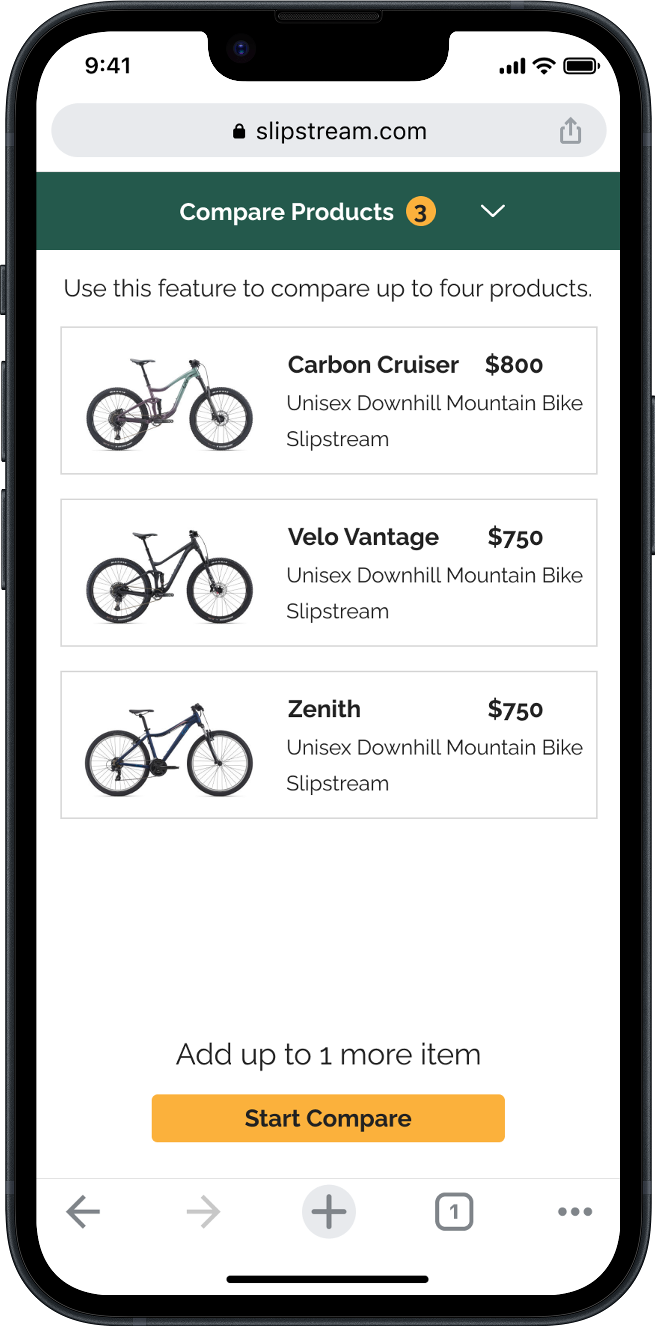
Compare Products Feature Solutions: The “Make Primary” feature was removed from both the desktop and mobile versions of the site (with the mobile product comparison page using a tab view instead of vertical and horizontal scrolling). This gave the opportunity to significantly decrease copy. Finally, the placeholder square was removed in favor of negative space and a countdown indicating how many spots are left.

Compare Products Bottom Sheet
Goal 4: Add additional details and filter option to user reviews.
-
User Reviews Solutions: A “sort by” options was added so users could sort reviews by rating, date, reviewer skill level, etc. The distribution of ratings was added, as supplementary information for the average overall rating. Finally, reviewer demographic information was added so users could better identify reviews from people of the same skill level, gender, and age.

User Reviews
Goal 5: Improve navigation within the checkout flow.
-
Checkout Flow Navigation Solutions: In the updated version of the checkout flow, the icons for the completed sections of the flow are not greyed out and can be used to navigate between sections (screen 1, screen 2). Additionally, the arrows associated with the order summary (screen 2) have been swapped out for “Edit” buttons. This indicates that the user can edit their information and not have to start over.

Payment information screen

Order review screen
Next Steps & Lessons Learned
If I were to continue my work on this project, I would want to do so by doing the following:
Complete at least one round of user testing of my mobile site prototype.
Compare pre- and post-project conversion data to ensure that the problems were solved and that we were solving the right problems.
With every project I complete, the importance of user-centered design, data-driven decision making, and iterative improvement are continually reinforced. Besides cementing these concepts in my mind, I learned a couple other lessons that I will take with me into my next projects:
Empower the User with Information: Informed shoppers are confident shoppers! Users require detailed product info and the ability to compare features, specs, and prices for informed buying choices.
Clarity and Accessibility: Organizing and presenting product info greatly affects user comparisons. Clear, structured, accessible data reduces user effort and frustration. Intuitive navigation and visual cues are key.
Streamlined Navigation: Clear and intuitive navigation is vital for a streamlined user journey. Minimizing friction in product discovery and search helps users find what they want, increasing conversion rates.